
Driving conversion by adding interest using interaction design in e-commerce app
Goal of the site: To encourage the user to order flowers by adding delight and decreasing friction in the checkout experience
“The project of iterations”


Step 1: Research & Empathize


Step 2: Ideate

Style Guide

This style guide includes the intended app typography, brand color scheme, icons, and buttons. Size, weight, and spacing is taken into consideration in order to optimize site continuity and aesthetics. This is meant to be a guideline and was improved upon throughout all stages of the design process.
Step 3: User Flow & Wireframe


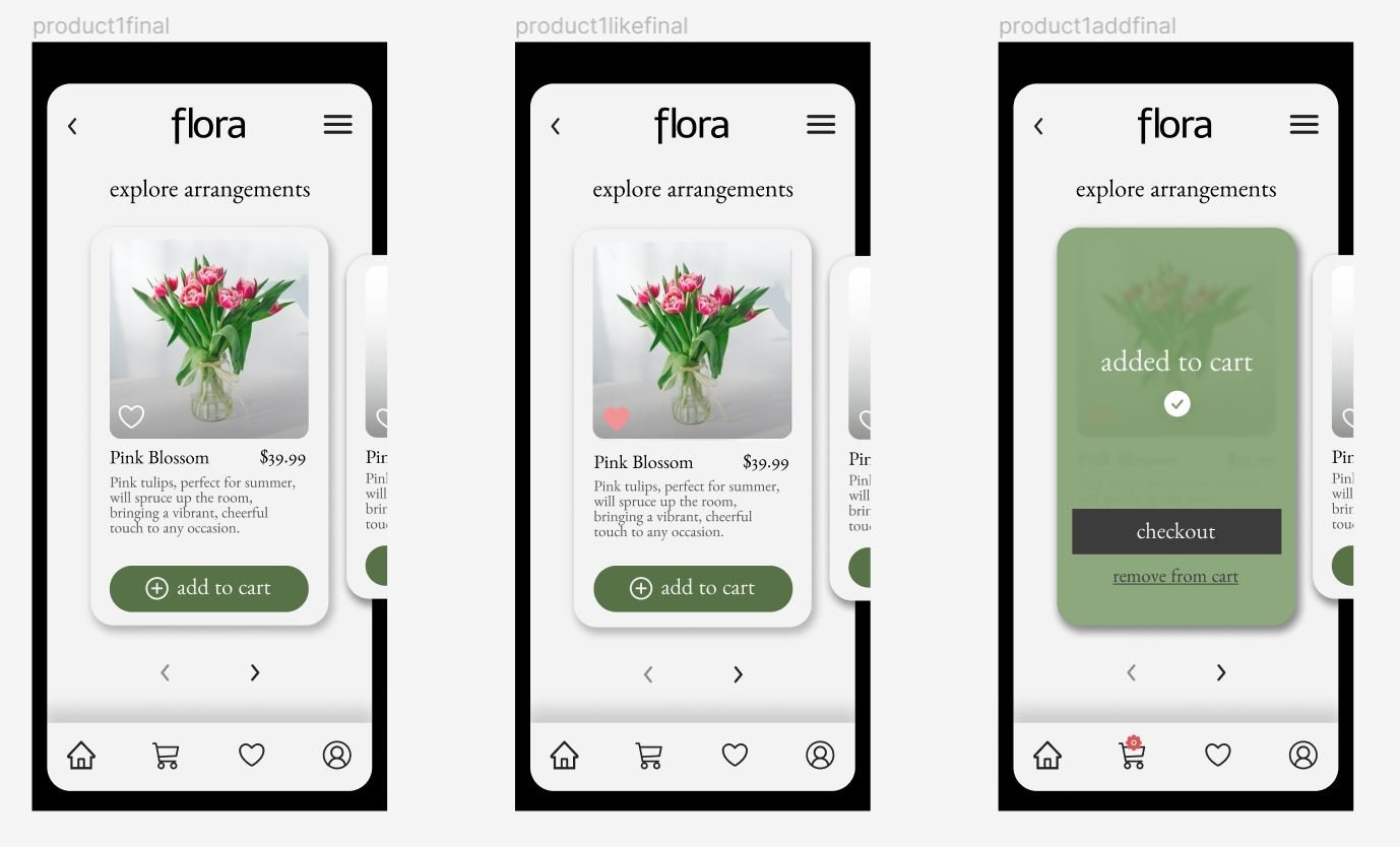
Step 4: Let’s Take It High Fidelity
Want to view the protoype?
Improvements

Speed
I can improve in terms of speed. I strongly believe in producing work with integrity, therefore I have spent many hours on my designs. I would like to work on efficiency without compromising attention to detail.

Research Insights
After collecting qualitative feedback from users, it was decided that a “cleaner” look was best to showcase the product. Initially, the navigation bars on top and bottom were pink. While this could enhance branding, it was decided that the colorful product on a less colorful background was preferred.

You tell me!
I’d love some constructive criticism on my designs, website layout, or any aspect of what you’ve seen on my site. I’m always looking for ways to grow and learn. Email me or fill out a contact form here.