Day 9 - E-commerce (1 Page)
Technically, this challenge is the twelfth day project but last week was quite busy, so I’m picking up here—my ninth day of designing!
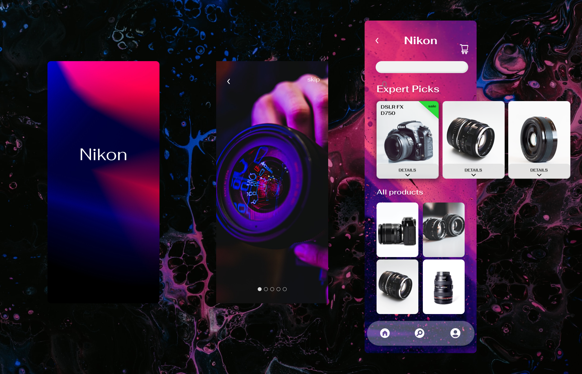
The challenge is to design one page of an e-commerce app. After looking into camera lens rentals for this weekend’s shoot, I decided on a Nikon app that sells cameras and lenses.
I feel like a camera app should be both intriguing and clean in terms of UI.
The image above shows a sample of what I came up with. I played with backgrounds for a while, deciding how artistic it should be, until I decided on this bright, abstract blue/pink art. It fits the theme of the rest of the app, and I think with the clean white backgrounds of the actual product images, it allows the product to still be the center of attention.
The goal of this design was to play around with components and interactions in Figma. The top carousal features a horizontal scroll, and the images under “all products” are vertical scroll.
I didn’t entirely figure it out this time. It’s a little “wonky” per the feedback I received. This is true. The vertical scrolling didn’t quite match what I was going for. I have decided to leave it as is since the overall objective of this blog/30 day challenge is to track my progress over time. I won’t be able to do that if I don’t publish my flawed designs! And, now I know what skills to target for my next design.

Image above shows the design system depicting typography, icons, buttons, and other components. The purpose of this is to be as intentional as possible and make some design decisions before starting the high-fi wireframe.
I chose to do a carousel on top to feature just a few products “picked” for the user. The vertical scroll below was chosen based on the fact that numerous images/products are easier to scroll through vertically for the user than to sift through horizontally one at a time.
If I were to improve this design, I would add more products, include more pages, and perhaps find a place for the price on the card. Ideally, the user would click '“details” below the image, and it would flow to a new page exclusive to the product with product details, price, and a place to add to cart. It would also be ideal for the home page to have an “add to cart” button to increase the likelihood of a user completing an action—benefits both the user/consumer and the business.